From Tiny Islands: Alphabets
Client: From Tiny Islands
Year: 2023
Industry: Fashion
Deliverables: Typography
The Brief
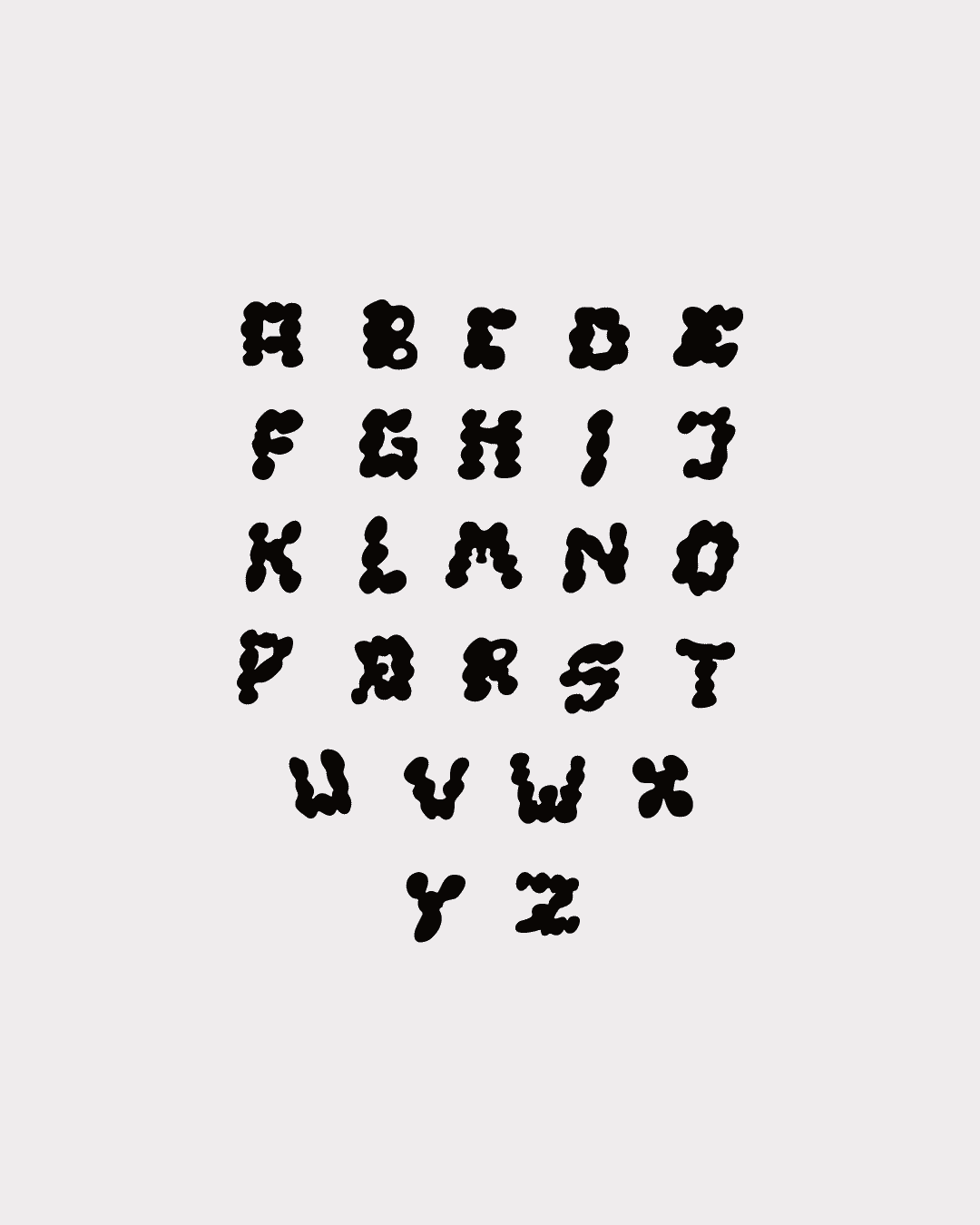
The brief was simple: they wanted chubby text.
From Tiny Islands sent a set of references for their next jewelry collection and then gave the studio full creative latitude. The references were reviewed and set aside, and the studio used the single adjective as a starting point and built a direction from it.
Chubby is not a style. It is a feeling: weight, roundness, presence. The question was what visual world carries that feeling with precision.
The Work
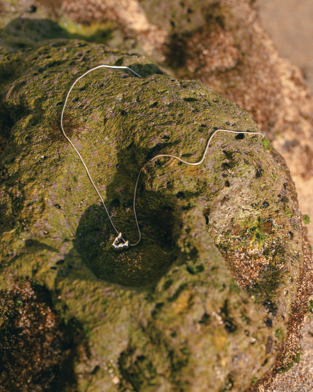
The answer was retro ceramics.
Handcrafted pottery from the mid-century era shared the same formal qualities the brief was asking for—bulbous, rounded forms with weight and organic irregularity. The surfaces are tactile. There is a playfulness in ceramic objects that is never frivolous, because the material itself has substance. That combination, playful but substantive, was exactly what the typography needed to carry.
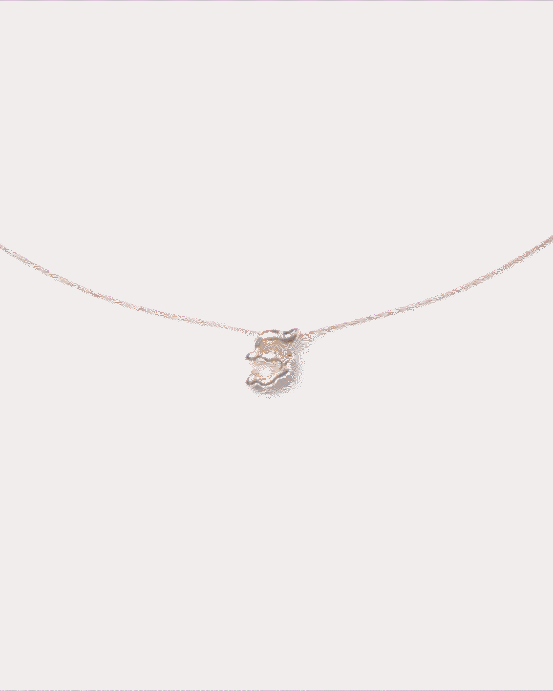
The letterforms were developed as if they had been made by hand from clay. Soft curves, fluid contours, strokes that swell and taper the way a potter’s hand would leave them.
Typographic Decisions
Every letterform was built around a single formal rule: no hard terminations. Where conventional type ends a stroke with a flat cut or a sharp serif, these letters round off as clay rounds off at the edge of a thumb. The weight distribution across each character is deliberately uneven, replicating the organic irregularity of something made by hand rather than by system.
The System in Use
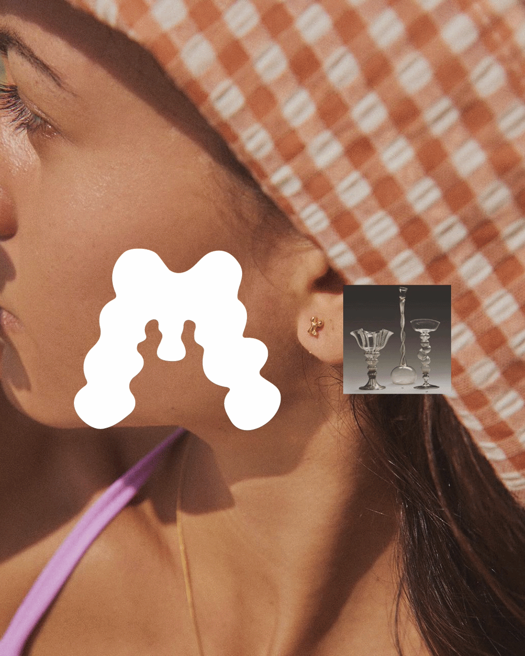
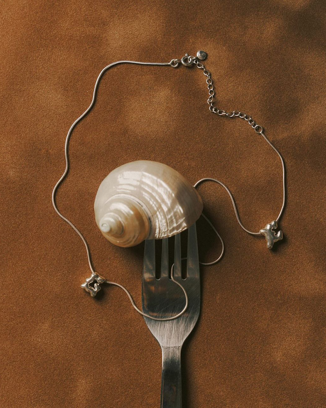
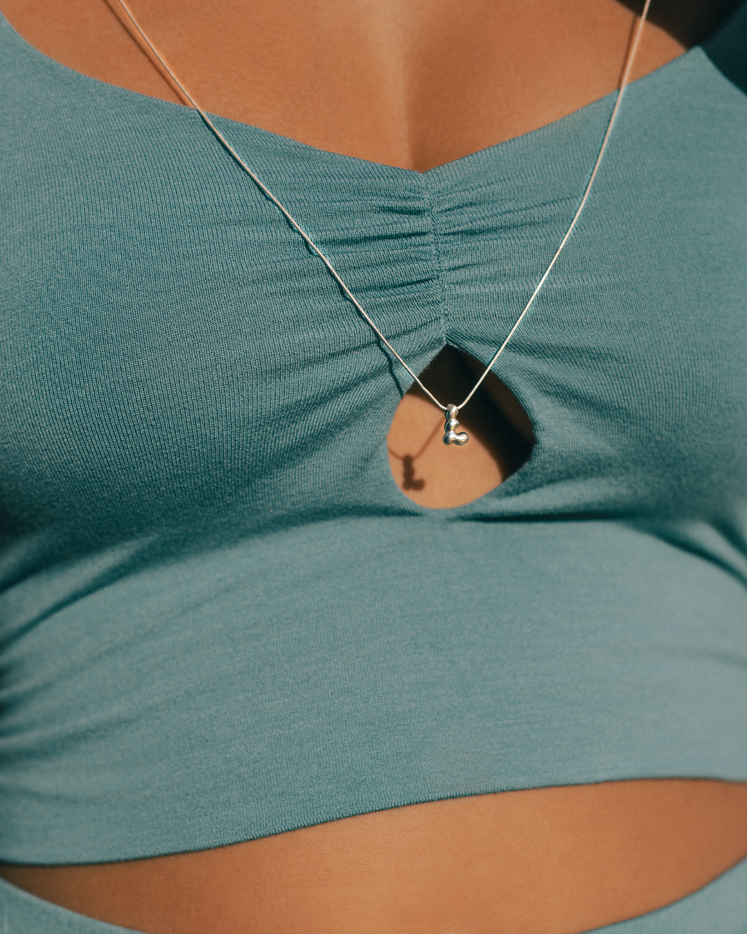
The letterforms were produced as earrings and necklace charms. The translation from type to jewelry is where the concept proves itself. These are not letters printed on a surface. They are letters made as forms, held in three dimensions, worn against a body.